
Turn your slides into presentations people actually pay attention to. Whether you're pitching to investors, teaching students, or trying to keep your team engaged on Zoom—make every deck count.
.png)
.png)


.png)
Master the essentials - how to use fonts that don't clash, balance colors that actually work together, and organize your slides so they don't look like a hot mess - plus data visualization techniques that transform your spreadsheets into clear, compelling stories.
Dive into what actually works when you need to present - whether that's to your team, your boss, investors, students, or clients. Learn the specialized techniques for presenting data, tables, and graphs that make your audience nod instead of nap - with real examples from actual presentations.

Follow along with me as we transform real presentations using PowerPoint on PC - the tool you spend half your workday in but still feel like you're wrestling with! No additional software, no design degree, no tears - just practical techniques you can steal and use immediately.
...and that's where I can help!
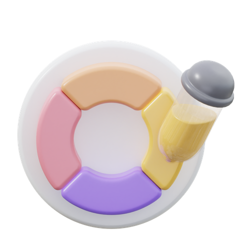
Learn how to balance colors (even bright reds) for slick slides that are clean and easy on the eyes.
.png)
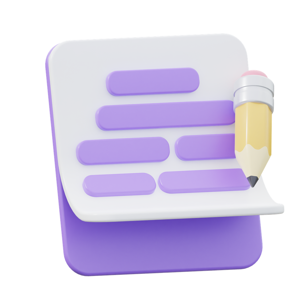
Use fonts to structure your text - headings, sub-headings, body text, captions, all in a beautiful flow.
.png)
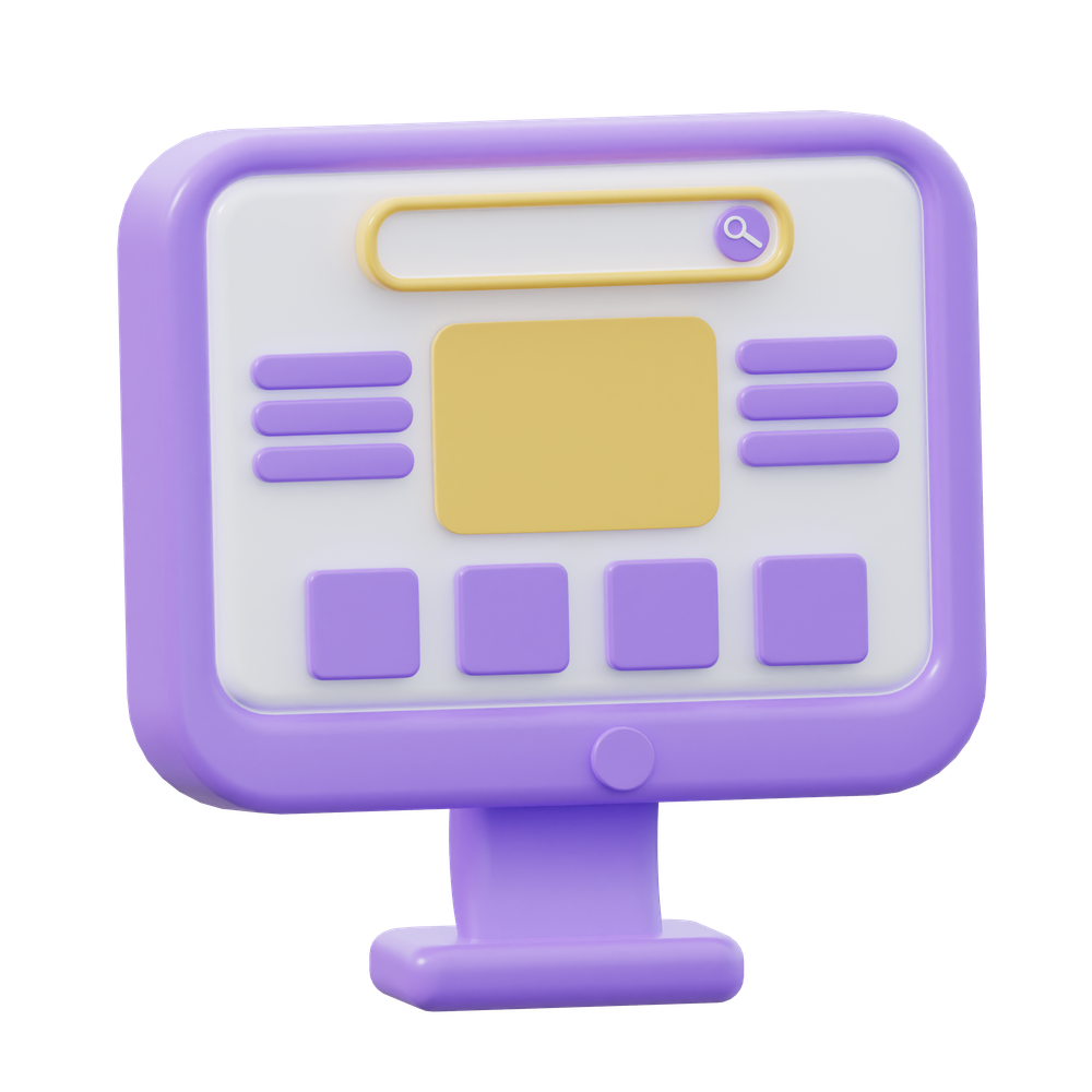
Hierarchy is everything - know where to draw your viewers eye first on key info to ensure nothing important is missed.
Tables, graphs, charts, dashboards, statistics... use them effectively to tell your story.

Icons, icons, everywhere. But do you really need them on each slide? Probably not.

Structure your flow so you engage your audience from start to finish (and keep them from checking their phone every 5 mins).

Some simple (and selective) animations can create a big impact to enhance your content.

The right transition from one slide to the next can make your deck flow even flow-ier.
Use templates without losing your deck formatting (and your mind) with my simple tips.

Adding background videos or audio can be a much needed break from static slides.
.png)
A picture tells a thousand words, but you dont need to overdo it to tell your story.

Once your deck is ready, learn how to share your deck in the right format.


I've been designing for the past couple of decades on a range of things – from visual brand identities to the UI for mobile apps to facilitating design thinking engagements – but my true calling revealed itself in the most unexpected place: designing stunning decks in PowerPoint.
I know, I know. Most people LOATHE making presentations, and you probably do too.
But here's the thing I realized – in the real world, your brilliant work doesn't matter if you can't present it clearly. And like it or not, that usually means you need to make slides, and love it or hate it, most companies give their employees PowerPoint to work with.
I moved over from ad agencies and in-house marketing roles to the corporate side about 5 years ago, and I've since seen loads of super-smart people struggle with basic PowerPoint formatting and content, and they end up presenting some... um... not-so-nice slides... that just didn't do their work justice.
These colleagues would see my presentations and say "Hey, nice slides – how did you do that?", asking for tips and training sessions. I started 1:1 sessions to help them, and trying to show them PowerPoint isn't as bad as they think.
As I helped my teammates, I had my lightbulb moment – instead of 1:1 sessions, I could make quick tutorials online to help people with varying skill levels learn the basics of design and storytelling whilst understanding how to effectively navigate PowerPoint, and really level up their work.
So, I've created HeyNiceSlides packed with videos and courses to teach you the practical stuff that actually works – no design degree required and no boring 2-hour tutorials that dive into topics you don't need to know about.
Whether you're starting in the corporate world, a teacher looking to engage students, an entrepreneur putting together your pitch deck, or just trying to impress your boss, you'll find quick, actionable techniques that'll have people coming up to you too, to say: "Hey, nice slides!"

If you have any questions, would like to discuss design services or just want to say 'hi' because you love PowerPoint as much as I do, get in touch!


Not able to tell you how happy I am with Opus. Best. Product. Ever! Wow what great service, I love it!
Lorem ipsum dolor sit amet,
Sign up for updates and early-bird discount on my courses!
Don't worry, I hate junk mail too and will only mail you when it's something super duper exciting.